We’ve just released the latest version of hTWOo-React, version 2.1. I’m going to be posting various updates highlighting some of the new updates over the next several weeks, so please check back or follow me on LinkedIn for more updates. For more information on hTWOo-React check out our documentation. For an overview of hTWOo please see this previous post or visit our hTWOo page.
hTWOo is a pure html and css implementation of Microsoft Fluent Design. hTWOo-React is a ReactJS wrapper for hTWOo-Core.
Dialogs in SPFx just got EASY
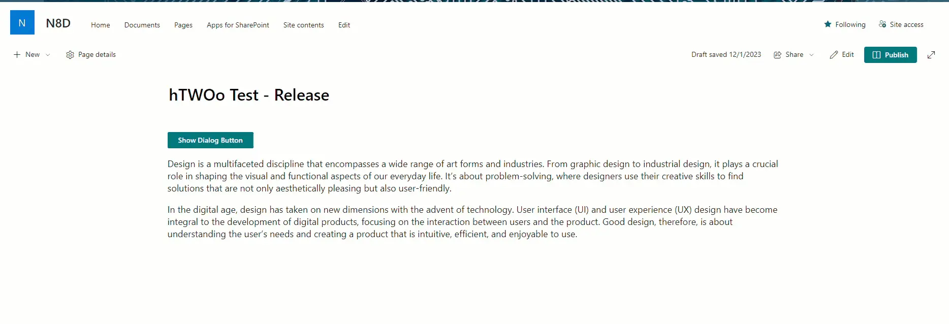
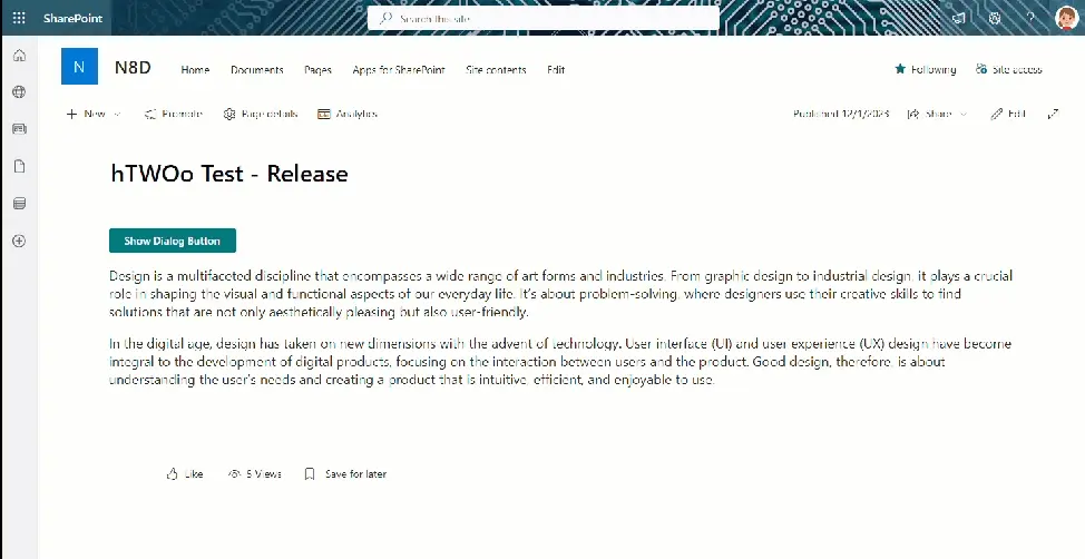
My absolute favorite update to hTWOo-Core 2.1 was the implementation of the dialog using the native dialog element which received more broad browser support in 2022. In previous versions of hTWOo if we wanted to implement a dialog that would sit on top of a SharePoint page we needed to jump through a bunch of hoops and do the dreaded DOM manipulation to get it into the page in a location that could elevate itself correctly in the z-index. There is an entire documentation page dedicated to the code and steps you needed to take in order to successfully implement one. Well, I’m thrilled to say NOT ANY MORE!!! WOOHOOOOOO!!!
The native dialog element has methods for show, showModal, and close and automatically elevates itself above the rest of the elements on the page. This gives us a lot of power to define our dialogs inline to our SPFx extension and know that we can make it the focus of the user experience. To make it even easier, hTWOo-React has built a dialog component that fully implements the fluent ui design and provides the functionality you need to display the various modal types.
Get Started Now
hTWOo-React includes documentation using Storybook which allows you to see the documentation and interact with the controls, so you can go see how the new updated HOODialog element works right now.
Types of Dialogs
The dialog component supports the following configurations:
Non-Modal:
- Standard - Information
- Standard - Error
- Standard - Success
- Standard - Warning
Modal:
- Sidebar - Left
- Sidebar - Right
- Topbar
- Bottombar
- Fullscreen
All dialogs components have a visible property that will trigger the show/close method depending on what type you’ve configured plus the ability to define the height or width of the dialog as makes sense again, based on the type of dialog. And as with all hTWOo React components you have control over the dialog element attributes to override the configuration as you desire.
Non-Modal Message and Status Bars
When you want a non-modal dialog to show a message or status you can use one of the standard dialog configurations. The four configurations offer colored visualizations with the ability to design the contents of the message through the children of the component. Basic configuration would include <HOODialogContent> and <HOODialogActions>. The first is a container where you can include the “message” elements of your dialog and the latter is where you can include things like <HOOButton> elements for actions you want to include in your user interface.
Model Dialogs
While non-modal dialogs are really useful, modal dialogs feel like the special sauce I’m often reaching for when I want to augment the user experience in Microsoft 365. Essentially the idea is that the user need to perform some type of interaction about a particular thing that’s on the screen. So you want to take over the UI but not navigate away from it which can be jarring. We give you lots of options; sidebars, top and bottom bars, centered, and maybe the most interesting of all, Fullscreen.
Sidebars (and top and bottom bars)
With sidebars there is a property for setting the width. The component implements this value using a CSS variable and so it takes a lot of different unit options. Certainly declarative values like 200px, but also dynamic values like 10rem or maybe the most appropriate a percentage which can be specified as 80% or 80vw (vw meaning view width), which is my personal preference. Same can be said for the bottom or top bars which can specify height, again via declarative or dynamic values.
Basic configuration would include <HOODialogHeaders> and <HOODialogContent>. The header provides a basic configuration for a title and a “close” action. You can specify the icon to use for the close, the title, and the method for the close action. The second is a container where you can include the “message” elements of your dialog.
Fullscreen
Fullscreen is it’s own thing. The configuration is the same as with sidebars above, however, when enabled it takes over the entire viewport. At this point you might want to pause and rhuminate on all the fun things you could do that would be evil, but if you reign yourself in you can also see how this could be an incredibly useful tool for providing a large surface to implement a custom user interface. That said, with great power, comes great responsibility so use it wisely.
Happy Coding!