I learned about CSS Variables from Stefan Bauer and his post CSS Variables support for SPFx projects through spfx-uifabric-themes. In a nutshell, this npm package, which I’ve started using regularly, transforms the current theme colors available to the SPFx web part into variables that can be used within your SCSS/CSS files. This intrigued me as it’s a native browser capability that’s been around since 2015 and because it means that you can affect the styling at run-time vs build-time… which translated means that lots of things you would normally think you’d need script for you can now do with a crafty use of CSS and some variables.
Generally, CSS Variables are scoped at the “root”, as Stefan does with the theme colors. This makes sense when you have values that should be consistent across the page. However, it turns out that CSS variables can also be scoped to an element and its children. Hmmm… this led me to realize that I can create these variables in the scope of the web part (not the page) and thereby they can have different values for each instance of the web part on the page. This design pattern came in super handy in my demo for the talk I was doing with Mark Rackley at this years SharePoint Conference (Anything you can do, I can do better… Embracing the SharePoint Framework). In the session Mark and I were discussing the merits of “advancing” your development skills [javascript -> typescript, leveraging certain packages, the async/await pattern vs promises, etc.] The goal for my demo was to take a JavaScript project that he had done and hosted in a content editor web part on a classic page and “modernize” it. I did this in a variety of ways but one of the coolest was this CSS variable pattern. So, let me show you.
What is a CSS variable?
According to w3.org, cascading variables are “a new primitive value type that is accepted by all CSS properties, and custom properties for defining them.” SCSS, which is pre-processed into CSS has the concept of a variable already, so this isn’t something that’s particularly novel, but what SCSS variables don’t give you is a way to define them through an elements style attribute, more on this later.
Creating and Scoping a CSS variable to the root
In your CSS (or SCSS) file you can define variables at the root of the page and then use them in your various styles.
:root {
    --main-color: red;
}
.myClass {
   color: var(--main-color);
}
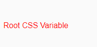
Now if I use that class on an HTML element I’ll render the following
Creating and Scoping a CSS Variable to an element
CSS variables, as defined above are cascading. So that means that I can redefine that variable at some other point in the style if I want and or define a new variable at that point that is only scoped to that element and its children. Building on the previous example.
:root {
    --main-color: red;
}
.myClass {
   color: var(--main-color);
}
.myAltClass {
   --main-color: white;
   --alt-color: blue;
   color: var(--main-color);
   background-color: var(--alt-color);
}
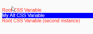
Now if I add another couple of elements that use both .myClass and .myAltClass I’ll render the following:
Utilizing web part properties to affect the values of the CSS Variables
So, this is excellent but the issue with defining these values in the SCSS/CSS is that they’re static for the implementation. Although that lets you use that variable throughout your styles and change it in just one place that doesn’t make it dynamic enough for the purposes of the solution I was trying to create. As I implied above, this is where the real superpowers of CSS variables come into play. You can define them via the style attribute of an element. Therefore, when using a framework such a ReactJS or Angular or Vue or Knockout (name your framework du jour), where I can easily build the DOM elements dynamically, I can create those CSS variables as well. So, using the ReactJS example, when I render the element, I can create those variables and then inject them into the DOM. Note that the div at the root of the “return” links to the classes linkTiles and tileCont and then defines a style which injects the styleBlock value which is where I defined the CSS variables, like this:
public render(): React.ReactElement<ILinkTilesProps> {
    //Create the CSS Variables based on the web part properties
    let styleBlock = { "--tileWidth": this.props.width + "px", "--tileHeight": this.props.height + "px" } as React.CSSProperties;
    //Render tile container as flex box
    try {
      return (
        <div className={`${styles.linkTiles} ${styles.tileCont}`} style={styleBlock}>
          {this.props.tiles && this.props.tiles.length > 0 && this.props.tiles.map((t: ILink) => {
            return (
              <Tile tile={t} showTitle={this.props.showTitle} />
            );
          })}
        </div>
      );
    } catch (err) {
      Logger.write(`${err} - ${this.LOG_SOURCE} (render)`, LogLevel.Error);
      return null;
    }
}
Then the CSS for this project has the following class definitions which use those variables I defined for height and width in a multitude of classes. Here’s a snippet.
.linkTiles {
  &.tileCont {
    width: 100%;
    display: flex;
    flex-wrap: wrap;
    justify-content: left;
  }

  .tile,
  .tileFlip,
  .tileFront,
  .tileFront>img,
  .tileBack {
    width: var(--tileWidth);
    height: var(--tileHeight);
  }
....
What that gives me is a completely isolated implementation of my style, so when two instances of that same web part are on a page their height and width as I defined them in the CSS variable is isolated to that instance.

I hope you can think of other great ways to use this cool solution, sadly though I suppose the spoiler is that they are not supported in IE 11 (https://caniuse.com/#search=css%20variable).
Happy Coding! As linked to above the complete source code for the solution can be found in my Public Samples repo.